
Movement and transitions are very important design aspects. They can guide your user through the application and help them understand states. If you are like me, you may have found yourself clicking some button over-and-over in an app with beautiful transitions, admiring the amazing work of designers and developers.
So you know a bit about HTML, CSS and JavaScript and did some basic websites? But you want to improve state transitions with some animation? Look no further, the following guide will walk you from basic transitions to more complex animations using keyframes 🚀
The Base
We will try to recreate the GIF above using plain HTML, CSS and (some) JavaScript. So if you want to follow this guide step-by-step, grab the boilerplate code from Github.
I suggest you use Chrome Webserver to serve your project folder. You can, of course, use any other
web server you like. Now open the project in your browser of choice (if you use Firefox, you need
to enable WebP support on the flags page Update: This is not needed anymore) and you should see
the following:
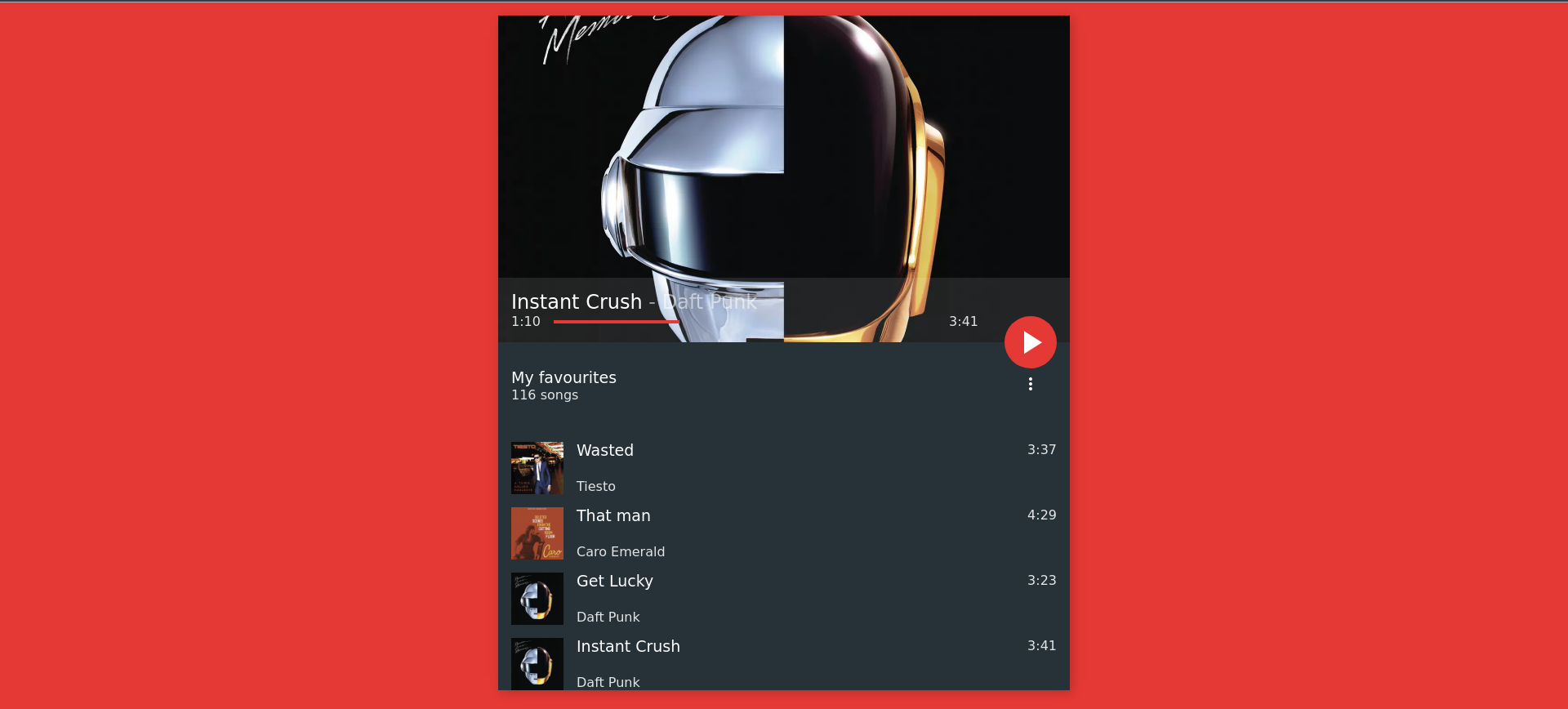
So, we want to animate the transition from the paused/playlist view state to the playing/song view state. The first thing we probably want to do is slide the songs list and the “Playlist” info out of the bottom, as this is probably the easiest thing to do.
Go fire up your favorite editor, jump to the project directory and open up the css/animations.css
file, this is where we will put all of out transitions, animations and transforms. Huh? Transforms?
Never heard of that? No worries, I’ll explain what those are.
CSS Transforms
Have you ever tried to animate something by changing its element.style.top value in JavaScript,
for example? You would have noticed that it doesn’t give you smooth 60 frames per second (or even 30
FPS on slower machines). But why? Changing values like top, left or even display cause a
so-called repaint, meaning that the whole page has to go through the rendering stage of your browser
again. That is the case because changing such values could also cause a reflow of the page (which
the browser cannot know before-hand). As creating moving elements with those properties has a very
high cost, there is one property to do animations that doesn’t trigger a repaint. Enter the magical
place of transform! The transform property has the following syntax:
transform: <transform-function> +;
There are many pre-defined transform functions, but I will only cover the most important ones:
translate(),translateX(),translateY()scale(),scaleX(),scaleY()rotate(),rotateX(),rotateY(),rotateZ()
Instead of giving you some horrible examples with boxes that are moving somewhere, let’s move the
playlist view out to the bottom of the screen (I think those properties are pretty
self-explanatory). Go add the following to your animations.css file:
.playlist {
  transform: translateY(0);
}

main.playing .playlist {
  transform: translateY(100%);
}
As you could probably guess, clicking on the play button toggles the playing class on the main
element of the markup (take a look). Now clicking it should have the following effect:
Awesome, the playlist view now slides out of the bottom, by translating it 100% of its height down the Y axis. But we definitely need some transition for that, as it looks just ridiculous right now!
.playlist {
  transform: translateY(0);
  transition: transform 0.2s ease-in-out;
}

main.playing .playlist {
  transform: translateY(100%);
}
By adding the line transition: transform 0.2s ease-in-out;, we create a smooth motion when moving
the element. The basic syntax for the transition property is:
transition: (<what> <duration> <easing-function>)+;
I know what you’re thinking:
Okay, so I’ve got that and it looks awesome, but I want moar!
Totally understand this, back when I did my first CSS animation, I could not stop doing more until I realized that I’d spent two nights without sleep, no eating and just three glasses of water! So we’ll animate the info-bar next, which needs to fill the screen, lose its background and then move some elements.
Animate all the things!
Okay, so after we made the playlist move out of the way, let’s make the current-playing display
full height:
.current-playing {
  transition: height 0.2s ease-in-out;
  will-change: height;
}

main.playing .current-playing {
  height: 100%;
}
You might stumble upon the will-change property, which is new (the rest should be pretty easy to
understand). It tells the browser that a given property will change shortly after. It just gives the
browser a chance to optimize the rendering tree to push as many frames as possible when changing
repaint-triggering properties. It is still a non-standard property and only might help rendering
performance, there is no guarantee it will. If you want to read more about this property, check out
MDN.
As you should have seen in our template animation, when clicking pause, the playlist does not
immediately come back up, but does so with a slight delay. We can achieve the same effect with the
transition-delay property. Go and modify the .playlist styles like so:
.playlist {
  transform: translateY(0);
  transition: all 0.2s ease-in-out;
  transition-delay: 0.2s;
}

main.playing .playlist {
  transform: translateY(100%);
  transition-delay: 0s;
}
Note that we set the transition-delay to zero in the playing state, so there is no delay when
pressing the play button and the playlist slides down instantly.
Now, let’s move the FAB into the center of the screen:
.fab {
  transition: transform 0.2s ease-in-out;
}

main.playing .fab {
  transform: translate(-300px, calc(-50vh + 16px));
}
There’s nothing really new here, if you don’t know what vh or calc are, you should definitely
read that up! The values in the translate function are pre-calculated by me and are dependent on
the width and height I gave my elements. The title and author of the track move from the infobar to
the top and the bar should lose its background color, as we can see in the template animation. So
let’s do that:
.current-playing .info {
  transition: background .2s ease-in-out;
}

main.playing .current-playing .info {
  background: transparent;
}

.current-playing .song-info {
  transition: transform .2s ease-in-out, left .2s ease-in-out;
}

main.playing .current-playing .song-info {
  left: 50%;
  transform: translate(-50%, -80vh);
}

.current-playing .song-info > * {
  transition: font-size .2s ease-in-out;
}

main.playing .current-playing .song-info > * {
  font-size: 36px;
}

.current-playing .progress {
  transition: margin-right: .2s ease-in-out;
}

main.playing .current-playing .progress {
  margin-right: 0;
}
On line 10 you can see how to set transitions for multiple values. We could also just use the line
transition: all .2s ease-in-out, but to squeeze even the last bit of performance out of the
browser, we give it all properties to transition separately (I generally specify all properties
until I have about 5 or 6, then I use all). Other than that there is nothing really new. Pretty
boring, huh? Okay so let’s sprinke in a bit of animation and @keyframes 🙂
Animation and keyframes
To give the cover it’s awesome animation, we cannot just use a transform: rotate(360deg), because
this transformation would only run once. We need to define a new animation that runs forever (or
until the user clicks on pause). We define a new animation via the @keyframes keyword:
@keyframes turntable-rotate {
  from {
    transform: rotate(0deg) translate(-50%, -50%);
  }
  to {
    transform: rotate(360deg) translate(-50%, -50%);
  }
}
Our new animation has the name turntable-rotate and animates from
transform: rotate(0deg) translate(-50%, -50%) to transform: rotate(360deg) translate(-50%, -50%)
in one run. (Note: the translate part is needed because of a positioning trick: to center an element
horizontally, give it left: 50% and translateX(-50%), you can also do this vertically). Now
let’s use this animation on the .cover:
.current-playing .cover {
  transition: all 0.2s ease-in-out;
  transform-origin: top left;
  clip-path: circle(100vh at 50% 50%);
}

main.playing .current-playing .cover {
  clip-path: circle(19vh at 50% 50%);
  width: 40vh;
  transform: translate(-50%, -50%);
  animation: turntable-rotate 2s linear infinite;
  animation-delay: 0.5s;
}
So we tell the cover to use the animation on line 11, which means “use the animation named
turntable-rotate, run it with a duration of 2 seconds per run, interpolate linearly (no easing) and
run it forever”. In line 12 we tell the cover to start the animation half a second after the play
button is being pressed, to create the “background-to-circle” effect. (Note: This code only works in
Chrome as Firefox does not support clip-path: circle() yet. I fixed this in the reference file, but
don’t include the fix here for times sake). Now after adding all of those animations, you should
have the following result:
Thank you for reading this post, I hope you now have some basic understanding of CSS Animation,
Transformation and Transitions. To download the project, visit
Github, to see the final
animations.css file, click
here.